Branding Agencies with Original Brand Concepts


Dribbble partnered with CapCut for the Product Drop Challenge, inviting designers to turn an original product idea into a complete brand using CapCut Design Studio. The strongest entries combined distinctive visual concepts with polished logos, packaging, and campaign assets, demonstrating originality, strong execution, and a clear creative point of view.
Beyond the challenge winners, we selected 35 branding agencies, studios, and creatives whose work stands out for original brand concepts and creative execution. These are the ones to consider when you need branding that moves beyond familiar visual formulas and makes effective use of modern design tools and workflows.
Table of Contents
Md Said
Md Said is a Dhaka-based graphic designer and illustrator specializing in vector illustration, visual design, and branding. He created LumiSip, a vitamin water concept built around playful character illustration and colorful fruit-inspired graphics. After developing the core artwork, he used CapCut Design Studio to turn it into a broader brand system, applying the visuals to can packaging, campaign creative, and lifestyle mockups.
LumiSip Vitamin Water

Koushik Biswas
Koushik Biswas is a Khulna-based brand identity designer specializing in logos, visual systems, and brand strategy. His AURA concept creates a luxury identity for a premium beverage brand, pairing a dark matte palette with warm gold tones and refined packaging. The logo combines concentric ripples, a water droplet, and a leaf motif to communicate purity, effervescence, and an organic character.
AURA – Visual Identity

Crumby Creative
Seth Ellenwood is a Nebraska-based graphic designer and digital illustrator behind Crumby Creative, with a focus on illustration, branding, and visual identity. For Moon & Myth, a holistic coaching and energy work practice, he created a mystical identity centered on hand-drawn imagery. A reflective reader and mythic dragon represent inner wisdom and difficult patterns, while the warm palette keeps the brand approachable. The system covers coaching materials, merchandise, social content, and future brand applications.
Moon & Myth: Brand Identity

MD Al Amin
MD Al Amin is a Bangladesh-based logo and brand identity designer focused on modern, minimal visual systems. His Verdevo concept creates a premium identity for an organic food brand using deep forest greens, botanical illustrations, and clean typography. The visual language extends from the logo into packaging and social media, giving the brand a cohesive system built around freshness, natural ingredients, and sustainability.
Verdevo – Brand Identity & Packaging

Creafinch
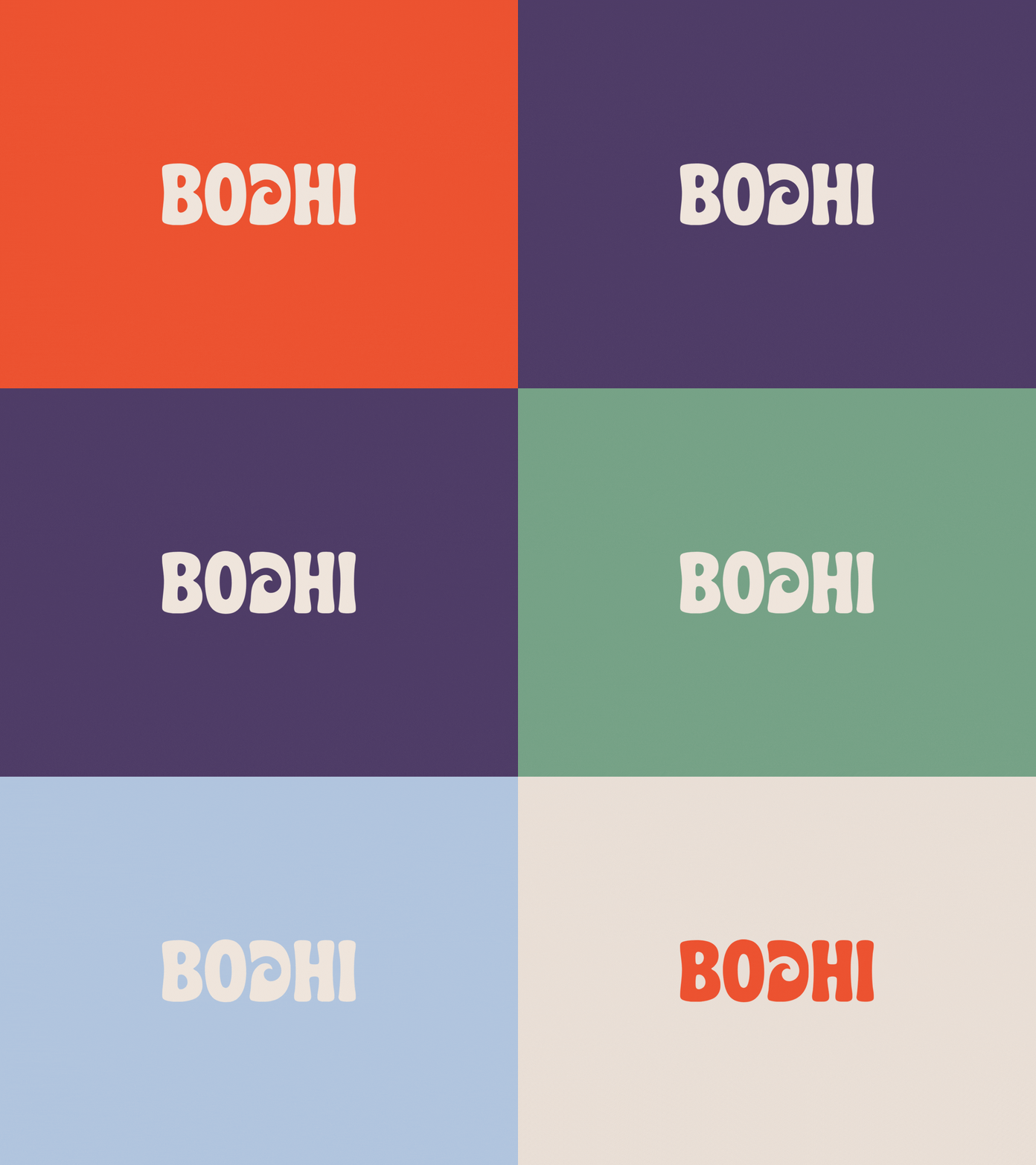
Creafinch is a branding and design studio focused on visual identities, packaging, and brand systems. Its BODHI concept reimagines a women’s surf brand around slow surfing, mindfulness, and coastal culture. Inspired by vintage California surf magazines and beach signage, the identity uses rounded typography, earthy tones, and a wave-inspired letterform across packaging, apparel, and campaign materials.
BODHI Branding & Packaging
Agata Kuczminska
Agata Kuczminska is an illustrator and icon designer whose work combines playful visuals with a sharp sense of humor. Her Slop Machine concept turns the unpredictability of AI tools into a satirical toy brand, starting with a hand-drawn sketch and vector illustration. The final system extends the idea into toy packaging, a logo, and campaign visuals while mixing traditional design methods with AI-assisted production.
Slop Machine – satirical toy concept

Bilal Haider
Bilal Haider is a brand and web designer from the UAE. He specializes in logo design, visual identity systems, and brand strategy. His Hamptions concept creates a playful identity for a kids’ learning academy using calming blues, warm neutrals, greens, and yellow. The system extends beyond the logo into signage, uniforms, backpacks, stationery, and social media, balancing a child-friendly look with a consistent, polished visual language.
Hamptions Brand That Inspires Young Minds

Artur Zherdetskii
Artur Zherdetskii is a Porto-based minimalist line artist and logo designer with nearly 10 years of experience in branding and illustration. His Litpage concept gives a reading app a simple visual idea: every page should feel like a small sunrise. The logo merges an open book with a sun, while a neon-yellow palette carries the concept across the wider visual identity.
Litpage — Reading App Brand Drop

Agata Krych
Agata Krych is a brand designer and illustrator with nearly two decades of experience across identity, icons, and web graphics. Her Obscura concept creates a premium eyewear brand for creatives, pairing obsidian black with vivid geometric motifs and playful illustrations. Krych developed the core identity manually, then used AI-generated mockups and personas to extend the system across packaging, advertising, and social media.
Obscura – Visual Brand Design System

Alfagamy
Alfagamy is an Indonesia-based logo and brand identity designer focused on simple, pictorial marks and visual systems. Ravel is a fine jewelry concept built around pieces formed from a single continuous strand of metal. The identity reflects that idea through fluid forms, warm earthy tones, and a tactile visual language that feels refined without becoming formal.
Ravel ✱ Brand Identity

Murat Kalkavan
Murat Kalkavan is an illustrator and character designer from Istanbul, known for humorous, expressive visuals. His BAD CAT concept turns mischievous feline behavior into a playful cat treat brand, using bold colors, imperfect hand-drawn lines, and a greedy cat character as the centerpiece. The identity extends across packaging, merchandise, posters, and campaign visuals, giving the fictional brand a distinctive personality and consistent visual language.
BAD CAT — Bad Cats Deserve Treats Too

Kate Keechook
Kate Keechook turns “what if?” ideas into polished visual systems, working across branding, illustration, animation, and 3D design. For NEXR, she reimagined canine supplements as a premium performance brand rather than a typical pet product. Inspired by the strength and athleticism of the Doberman, the identity combines bold typography, a restrained palette, and cinematic imagery across packaging and campaign visuals.
NEXR – Premium Canine Supplements Branding

Avevn
Avevn approaches branding as a system built to stay recognizable across every touchpoint. For this concept, designer Anna developed a restrained identity with a deliberate tension between precision and provocation, extending it across packaging, campaign imagery, and physical objects. CapCut Design Studio supported the exploration of multiple visual directions before typography, scale, color, and composition were refined into one cohesive product launch system.
AVEVN Brand Concept

Eashin Arafath
Eashin Arafath specializes in logo and visual identity design, with a focus on clean, modern brand systems. For Pexse, a conceptual AI productivity platform, he built the identity around a geometric “P” symbol and a blue-to-purple gradient that signals speed, connectivity, and technology. The system carries the concept across packaging, digital assets, and campaign visuals while keeping the overall look sharp and consistent.
Modern AI SaaS Brand Identity – Pexse

David Vicente
David Vicente creates bold, character-driven visuals that blend illustration, branding, packaging, and pop culture influences. For ICONIK GARGOYLES, he transformed an illustrated character universe into a collectible designer-toy brand featuring six distinct figures. A handwritten logo, cinematic neon campaign art, and premium packaging give the collection a cohesive identity while preserving each character’s individual personality.
ICONIK GARGOYLES Designer Toy Collection

Hassan Amharrar
Hassan Amharrar works across branding, print, and social media design, with a strong focus on graphic identity and AI-assisted creative work. For AETHER, he built an audio brand around a simple headphone-and-waveform symbol, pairing it with muted gray tones and clean typography. The restrained system carries naturally across product packaging, digital ads, and social content, giving the concept a sleek, tech-focused feel.
AETHER

Muledraws
Muledraws is a designer and illustrator with experience in apparel, merchandise, and watch design. For Venezianico’s Nereide Acquaforte, he drew on classical and Renaissance art to create an engraved watch case centered on acanthus leaves, a motif associated with harmony and decorative craftsmanship. The concept blends historical references with a contemporary luxury product, giving the watch a distinctive visual identity rooted in Italian art and engraving traditions.
Nereide Acquaforte

Petar Shalamanov
Petar Shalamanov brings more than 15 years of logo and identity experience to clean, highly recognizable brand marks. For Terragrid, a company focused on power land acquisition and data center development, he built the identity around a minimal TG monogram. Sharp geometry, dark-mode styling, and restrained neon accents give the system a technical, high-value feel that works across digital interfaces and large-scale architectural applications.
Logo & Brand Identity for Teragrid

Rammo Paul
Rammo Paul combines brand strategy with visual and digital design, creating identity systems aimed at helping startups become more recognizable and consistent. For Cravyo, he developed a food brand identity around earthy neutrals, vivid green, and warm red accents, giving the concept an energetic but grounded character. The visual system brings together logo design, illustration, and graphic elements to create a flexible identity suited to a contemporary food brand.
Cravyo Food Brand Identity

Renato Rena
Renato Rena brings a motion and campaign mindset to branding, with experience across illustration, animation, and video. For The Iced Coffee Shop, he built a fictional coffee brand around a logo that merges an ice cube with flexible typography. The identity expands into packaging and social campaign visuals, with CapCut Design Studio used throughout the process from early logo exploration to final branded assets.
The Iced Coffee Shop Project

Formque Digital
Formque Digital builds modern brand identities through strategy, typography, packaging, and visual storytelling. For Vellutto, the studio created a warm, refined identity that starts with a custom logo and expands into restaurant stationery, web concepts, social media, and environmental mockups. AI-assisted exploration helped speed up composition and presentation testing, while the core identity and final refinements remained grounded in traditional design work.
Vellutto — Logo and Visual Design System

ktnr.23
ktnr.23 works across brand design, visual identity, UI, and motion, with a particular focus on app-driven products. For TravelKit, a travel planning app concept, the designer created a friendly visual identity around a custom character and a bold lime-green palette. The character was first developed in Figma, then expanded into illustrations and campaign posters that give the brand a cohesive, launch-ready look.
TravelKit

Muhammad Adnan
Muhammad Adnan brings more than 20 years of experience across logo design, branding, packaging, and print. For Meat Wala, he developed a fresh meat brand identity built around a bold, highly recognizable logo and an earthy palette of deep reds, greens, and neutrals. The system gives the brand a clear visual personality that can extend naturally across packaging, signage, and promotional materials.
Meat Wala Fresh Quality Meat Logo Brand Identity Design

Santiago Design Co.
Santiago Design Co. specializes in logo and brand identity design built around clear storytelling and memorable visual systems. For Patty’s Drive-In, the studio reworked classic American diner aesthetics into a cleaner contemporary identity using a custom script logo, bold red-and-cream colors, and condensed display type. The system extends across takeaway packaging and launch campaign visuals built around the line “Burgers Done Right.”
Patty’s Drive-In — Retro Burger Brand Identity

Anna
Sami
Sami brings more than a decade of experience in branding, illustration, and animation to identity systems with a strong conceptual core. For LUCID, he imagined a neural wearable that records dreams and turns them into visual memories. The identity uses negative space, signal-inspired forms, monochrome visuals, and a luminous cyan accent to balance clinical precision with surrealism across the device, packaging, app, and campaign imagery.
LUCID

Designer Jahid
Designer Jahid has 6+ years of experience creating logo and brand identity systems for startups and established businesses. For Ember and Oak, he developed the logo, product mockups, and campaign assets entirely in CapCut Design Studio. The concept shows how a simple identity can be carried consistently across packaging, social media, and promotional visuals while maintaining a clean, modern brand language.
Ember and Oak

Hamster & Hammer
Hamster & Hammer specializes in logo, label, and packaging design, with a strong taste for vintage-inspired visual systems. WEST LAND is a zero-proof ranch water concept built around bold Western cues, including cowboy imagery, retro typography, and warm desert tones. The identity carries across the can design and campaign visuals, giving the fictional beverage the feel of an established regional brand with a contemporary nonalcoholic twist.
WEST LAND — Zero-Proof Ranch Water

LogoFarmers™
LogoFarmer’s Studio focuses on strategic logo and brand identity design for businesses across industries. For SOVEN, the studio developed a premium headphone brand from the ground up, combining a restrained monochrome palette with sleek product visuals and minimal typography. CapCut Design Studio was used to organize concepts, test layouts, and generate supporting imagery, while the final system extended across brand guidelines, product visualization, marketing assets, and a cinematic launch campaign.
SOVEN — Premium Audio Product Branding

MD Helal Akbar | Logo Designer
MD Helal Akbar focuses on logo and brand identity design, building visual systems that can scale across digital and physical applications. For Prime Zone, he created a sportswear identity around a custom PZ monogram shaped like a lightning bolt to suggest speed, power, and performance. The system expands into apparel, packaging, retail assets, web concepts, and campaign graphics, turning a simple logo into a complete sportswear brand experience.
Prime Zone | Sportswear Brand Identity & Product Drop Challenge

Krafted
Krafted brings a strong illustration and 3D sensibility to branding, with work spanning icons, animation, and visual design. For Strike!, the studio created a retro-meets-modern bowling alley identity with a bold palette, flexible logo lockups, graphic patterns, and playful mockups. CapCut Design Studio helped shape the initial direction and organize the wider brand system before the concept was refined into a cohesive final kit.
Strike! Bowling Alley Brand Kit

Slidefactory Studio
Slidefactory Studio works across presentation, branding, and visual design, with a focus on polished systems that translate well across formats. For NUMA, the studio created a lively juice identity built around playful fruit mascots, bright packaging, and bold typography. The concept extends into posters, social media, motion graphics, and product mockups, giving the brand a cheerful personality while keeping the visual system consistent across touchpoints.
NUMA – JUICE VISUAL IDENTITY BRAND CAMPAIGN

Luk Olivari
Luk Olivari is a graphic designer and illustrator with more than a decade of experience building brands through strategy and expressive visual work. For Triple Seven, a post-tattoo repair balm, he turned old-school flash tattoo imagery into a bold skincare identity using hand-drawn moths, skulls, daggers, and lucky sevens. The artwork was developed into a two-color system spanning custom lettering, packaging, and campaign visuals.
Triple Seven – Tattoo Balm Branding

Orbix Studio – Brand Identity Design
Orbix Studio creates complete brand identities spanning logos, visual systems, packaging, and digital applications. For MELO, a neighborhood café concept, the studio built the identity around the idea of slowing down and savoring the moment. A droplet inspired by pastry filling flows into the logotype, while rounded forms, earthy colors, and subtle root and branch motifs give the brand an organic, welcoming character.
MELO Cafe Branding Design | Logo & Visual Identity

Michał Pieczyński
Michał Pieczyński specializes in logo design, typography, and brand identity. His RA/AR monogram explores how two letterforms can be merged into one compact, recognizable symbol. The design uses overlapping geometric shapes and a restrained purple palette to create depth while keeping the mark simple and adaptable. Created for the CapCut Product Drop Challenge, the concept reflects Pieczyński’s focus on timeless, versatile identity design.
RA or AR Monogram Logo Design

Find a Right Branding Partner
The right branding partner can turn an early idea into a visual identity that feels distinctive, consistent, and ready to grow. The designers and studios featured here show a wide range of creative approaches, giving brands plenty of options depending on their audience, product, and visual direction. Use the projects above as a starting point to find a team whose style and thinking align with the brand you want to build.