The Branding Package Checklist & Pricing Guide (2022)
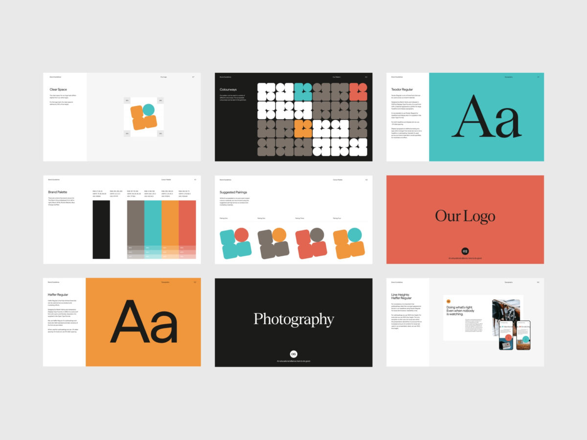
No matter what type of product or service you offer, you need to portray the right image to your target audience. A cohesive brand identity design helps you do just that. One way to support a cohesive brand identity is to create a branding package for your business. Keep reading to learn more about what a branding package is, what it should include, and how much branding packages cost on average.
What is a branding package?
Simply put, a branding package refers to all the visual assets you need to create a cohesive brand image. A full branding package typically includes a variety of digital and print assets. Examples include business cards, email templates, color palettes, product packaging, and anything else you need to create a memorable brand identity.
A branding package refers to all the visual assets needed to create a cohesive brand image.
Branding Package Essentials
Although a custom brand package can include anything that helps you deliver a consistent visual experience, some items are more common than others. Logo design, color palettes, brand typography, and brand style guides are some of the most common branding elements.
✔️ Logo design
Well-designed logos help customers form emotional connections to favorite brands, making them an important asset for any business. For best results, your branding package should include several variations of your custom logo. Having multiple versions of a logo makes it easier to build a consistent brand identity across all formats.
Your primary logo may look great in print, but it’s helpful to have smaller submarks in your branding package. Whether you operate a small business or a large corporation, your logo color schemes and fonts should also be consistent. A high level of consistency makes it easier for customers to associate logo variations and submarks with your overall brand.
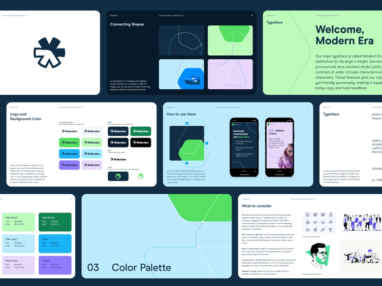
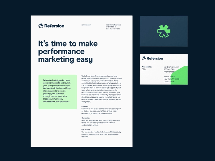
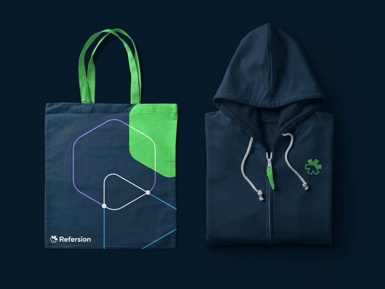
“Refersion is an online platform that specializes in affiliate marketing. Our goal was to present Refersion as a trustworthy, professional brand while maintaining their familiar and dedicated approach to customer service.” — Balkan Brothers, Branding Agency
✔️ Color palette
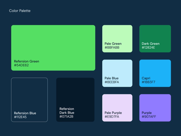
To maintain a consistent visual identity, it’s important to include a color palette in your brand package. A color palette contains all the brand colors you use to create signage, product packaging, stationery, social media headers, and other promotional materials. The colors you choose should represent your brand’s personality and strive to elicit an emotional response from members of your target audience.
It’s important to be as detailed as possible when creating a color palette for your branding kit. Each color should be identified by its Pantone Color code or CMYK/RGB values, not vague descriptions like “light green” or “dark purple.” Using specific color codes ensures that every in-house or freelance graphic designer uses exactly the right shade of each color, promoting consistency in all brand design elements.
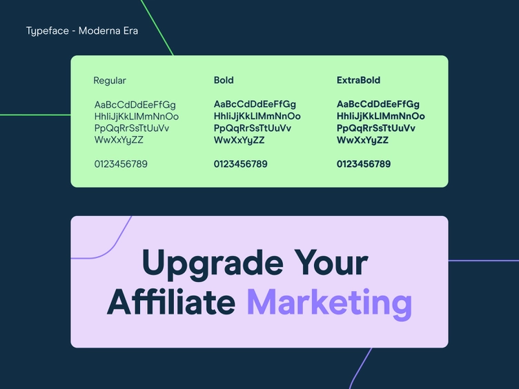
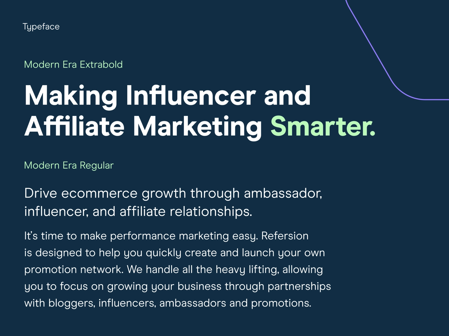
✔️ Brand typography
Typography-related decisions have a major impact on how people view your brand. After all, the masthead of The New York Times wouldn’t look quite the same without its signature decorative serifs and Engravers’ Old English BT font. Typography refers to the overall appearance of your text.
Whether you’re designing a printed banner or an email header, you need to think about font type, text size, and text placement. Negative space — the empty space around text and graphics — is also an important consideration. Your brand guidelines should tell designers what fonts they can use and include explicit instructions regarding capitalization, spacing, and size.
✔️ Brand style guide
Think of the style guide as a comprehensive manual used to define your brand and promote consistent communication. Once you have a basic brand identity package, you can create a style guide by adding photography guidelines, rules for logo usage, and details to help content writers and other employees achieve just the right tone when developing your marketing materials.
The most comprehensive style guides also include rules for grammar, formatting, and word choice. For example, a brand style guide may contain a list of words that should never be used to refer to the brand or guidelines regarding the use of hyphens, bulleted lists, and serial commas.
Other branding package collateral
Once you have the basic elements of your branding package in place, you can create additional assets and use them to make your communications even more consistent. The right elements for a branding package depend heavily on the size of your business and what type of audience you serve. Consider adding the following to your existing package or creating a new branding package to accompany a complete rebrand of your business.
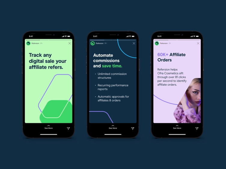
✔️ Social media graphics
Your social media pages should match your website and other promotional materials in terms of colors, fonts, and typography. One of the best ways to ensure consistency is to add social media graphics to your branding package. Many of these graphics are used as headings on profile pages, ensuring that anyone who sees your profile associates it with your brand.
You can also hire a designer to create video thumbnails, profile images, infographics, quote graphics, or any other type of social media templates. To deliver a cohesive experience to your target audience, these items should have the same look and feel as your other marketing materials.
✔️ Stationery
As you create your branding package, don’t forget about stationery templates and guidelines for using company stationery in a way that’s consistent with your brand image. These stationery guidelines from William & Mary are a good example of how to incorporate this information into your branding package. As you can see, they provide plenty of detail — right down to how to set the margins on each version of the letterhead — to help employees comply with the college’s standards.
✔️ Slide deck presentation template
Many business branding packages also come with slide deck presentation templates, or collections of slides that can be used to create PowerPoint presentations. While creating a slide deck presentation template, be sure to refer to your branding guidelines. You should use the same typography, logos, and color palette for the slide deck template as you would for a poster or an email newsletter. When someone in your target audience sees the presentation, they should immediately associate the design with your brand.
✔️ Illustration system
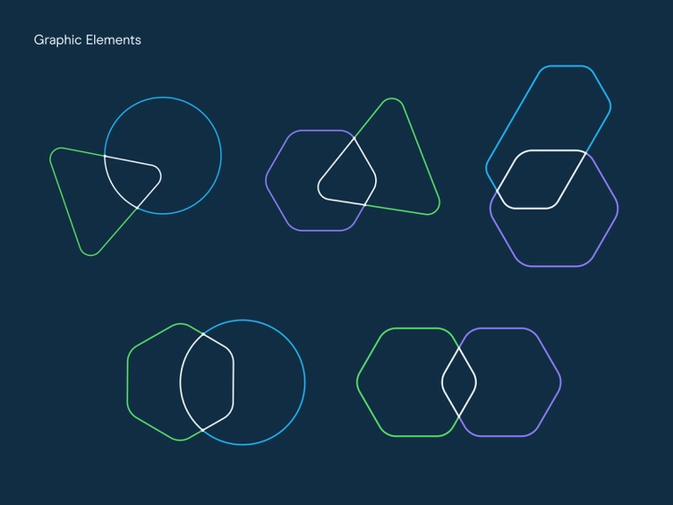
If your company works with several graphic designers, you want them all to be able to create artwork that matches your brand’s personality. You don’t want each one to apply their own personal style to your company’s designs. That’s why it’s important to include an illustration system in your branding kit. An illustration system is a set of guidelines used to create artwork in a specific style.
This resource typically includes standards related to color usage, icons, brush weight, composition, and props. If you give your designers access to a comprehensive illustration system, they’ll be able to produce graphic elements that are an exact match for your brand’s style and personality.
✔️ Email templates
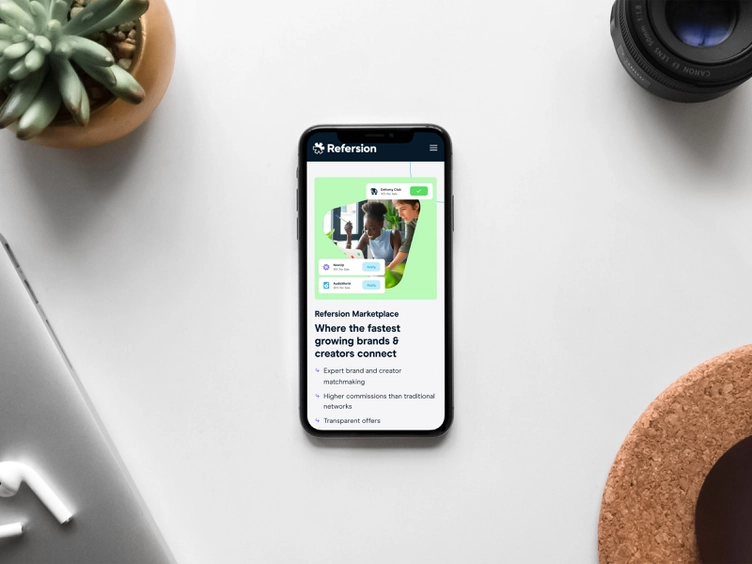
Before you write a single word of copy, you must have an eye-catching design that adheres to the guidelines in your branding package. Using email templates can help you save time and increase consistency, reducing the number of revisions needed before you click “send”. According to the email marketing experts at Constant Contact, a good email template should include the following elements:
- Logos: Every email should include your company’s logo. It’s also standard to link your logo to your website to make it easier for readers to find out more about your company.
- Colors: Use your standard color palette to choose colors for your email template. Your headline, dividers, buttons, and backgrounds should match the palette exactly.
- Images: If you use images, they should support your brand identity and adhere to your company’s photography guidelines.
- Text: All text should be large enough for readers to see without having to enlarge their screens. It should also conform to your company’s typography guidelines.
- Footer: Ensure your footer matches your company’s color palette and typography guidelines. Include your contact information to make it easier for readers to connect with you.
✔️ Ad designs
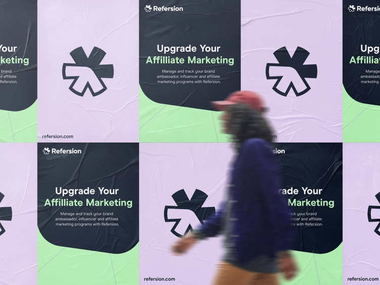
Whether you’re sticking to print or going digital, your branding package should include sample ad designs to guide graphic designers and advertising professionals as they create new campaigns. Each ad should contain your company name, your logo, a visual representation of your product or service offering, a value proposition, and a call-to-action button. Every element should also follow your brand guidelines in terms of typography, color palette, photography, and illustrations.
✔️ Photography
Rachel Gillett of Fast Company reports that people are more likely to remember content that has images in it. That makes high-quality photography extremely important for companies of all sizes. Whether you have an in-house photographer or plan to hire a freelancer, you can get better results if you take the time to include photography guidelines in your branding package.
You may want to write guidelines regarding composition, content, tone, and color palette. It’s also a good idea to document whether you want to focus on people or objects in your company’s photos. The more detail you include in your branding guidelines, the easier it is for a photographer to achieve just the right look. If you create a guideline emphasizing candid shots instead of posed photos, for example, your photographer will be able to plan accordingly.

✔️ Miscellaneous assets
Big companies may have more than a dozen assets in their brand packages. These assets include icon sets, stickers, product packaging, signage, event branding, company merchandise (“merch”), and brochures. The more guidelines and samples you include in your branding package, the more opportunities you have to ensure consistency in every brand message. Including these items also makes it easier to hire and manage graphic designers, photographers, freelance writers, and other independent contractors who have the skills needed to grow your brand.
How much does a branding package cost?
Pricing for design and branding services depends on the size and maturity level of your business. If you’re just starting out, you may need a full-stack agency to create everything from scratch. Established businesses may be able to hire a freelance graphic designer to meet their needs.
- Agency Pricing:
Full-stack agencies do everything from creating collateral to implementing marketing campaigns, making them the more expensive of the two options. If you hire a full-stack agency, you may need to pay a retainer or sign a contract committing to a minimum service term. Branding packages will vary in price depending on the agency, and can cost anywhere between $5,000 to $100,000 depending on the size of the package.
- FreelancerPricing:
Freelancers typically charge by the hour, making it a bit easier to estimate the cost of creating a complete branding package. Morgan Overholt of Morgan Media explains that designers charge anywhere from $15 to $300 per hour based on their skills and experience. Some freelance designers charge a flat fee for each project completed.
If you decide to hire a freelancer, ask to see samples of email templates, social media graphics, and other branding elements first. Reviewing samples can help you choose a graphic designer with a style that matches your brand’s personality. Use Dribbble’s Designer Search to find the right designer for your needs.
Beautiful branding package examples
If you need some inspiration for your own branding package, take a look at these stunning examples.
Sungrown Branding Package
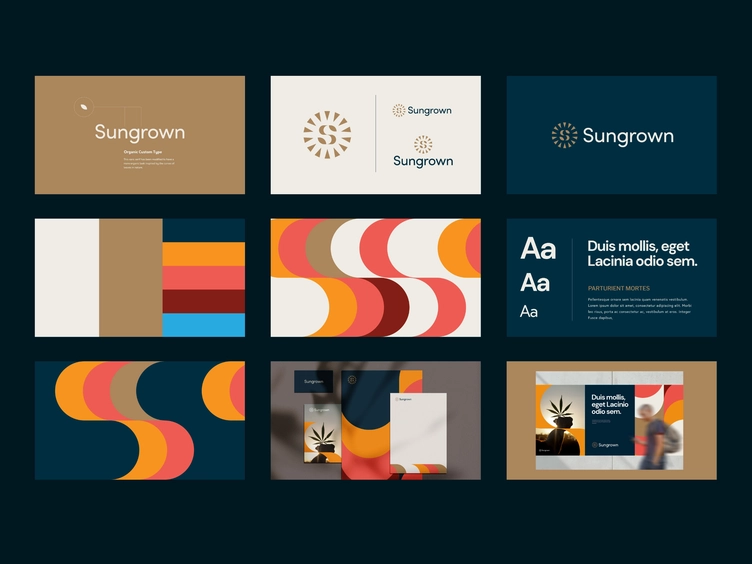
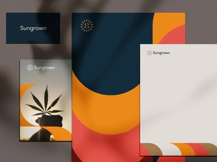
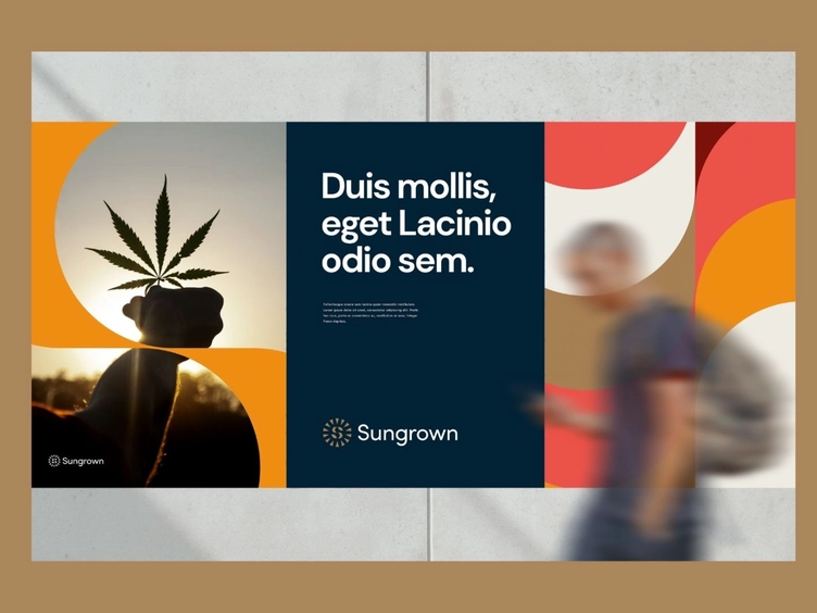
Independent designer Kevin Craft designed the Sungrown branding package for a cannabis dispensary that wanted to incorporate nature into its branding elements. Inspired by the sun’s rays and the shape of the cannabis leaves, he created a monogram S with leaves instead of serifs on each end. Craft also used a modified sans serif typeface to create a more organic look.
Haystack Branding Package
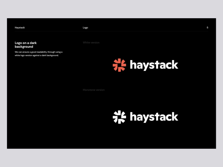
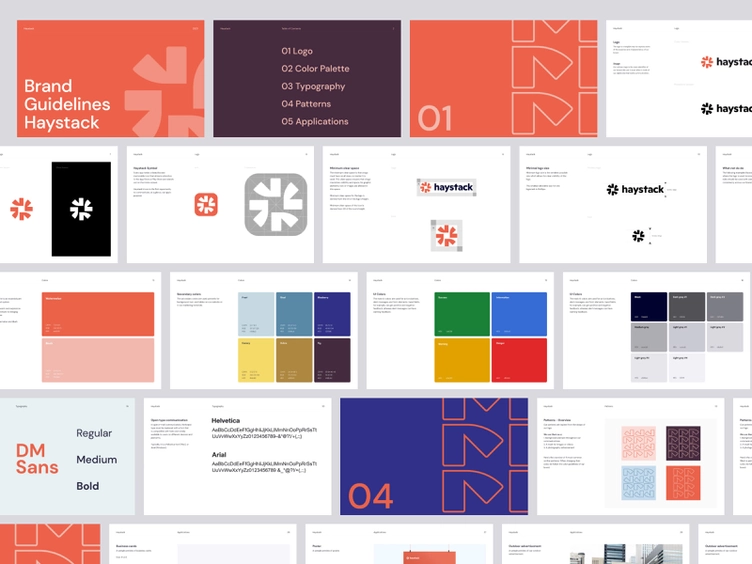
If you want an example of a strong brand identity, check out Haystack’s branding package designed by Balkan Brothers. Notice how the color palette includes secondary colors, along with examples of how to combine colors in a visually appealing way that also matches the brand’s aesthetic. The color palette includes the HEX, RGB, and CMYK values for each color, making it easy for designers to match the brand’s colors exactly.
“We aimed to convey Haystack’s personality through visuals. That’s why we created a clean, simple yet sophisticated, and ownable identity.” — Balkan Brothers, Digital Agency
AWSM Sauce Branding Package
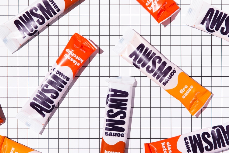
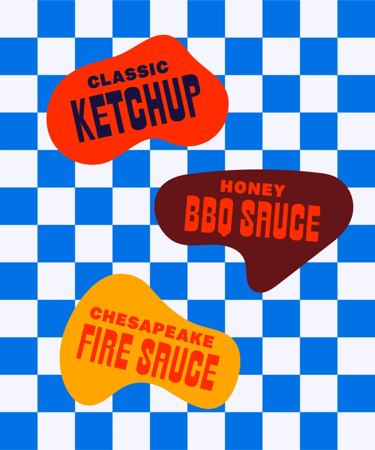
AWSM Sauce does more than just make tasty sauces; the company also emphasizes sustainability in its business practices. Herefor Studio worked closely with the AWSM team to design their brand identity, packaging, illustration, and icon system from the ground up. View the full case study here.
“We were inspired by the approachability and modesty of diners and worked to convey those feelings through color, pattern, and the use of a variety of typefaces.” — Herefor Studio
Happy Tooth Branding Package
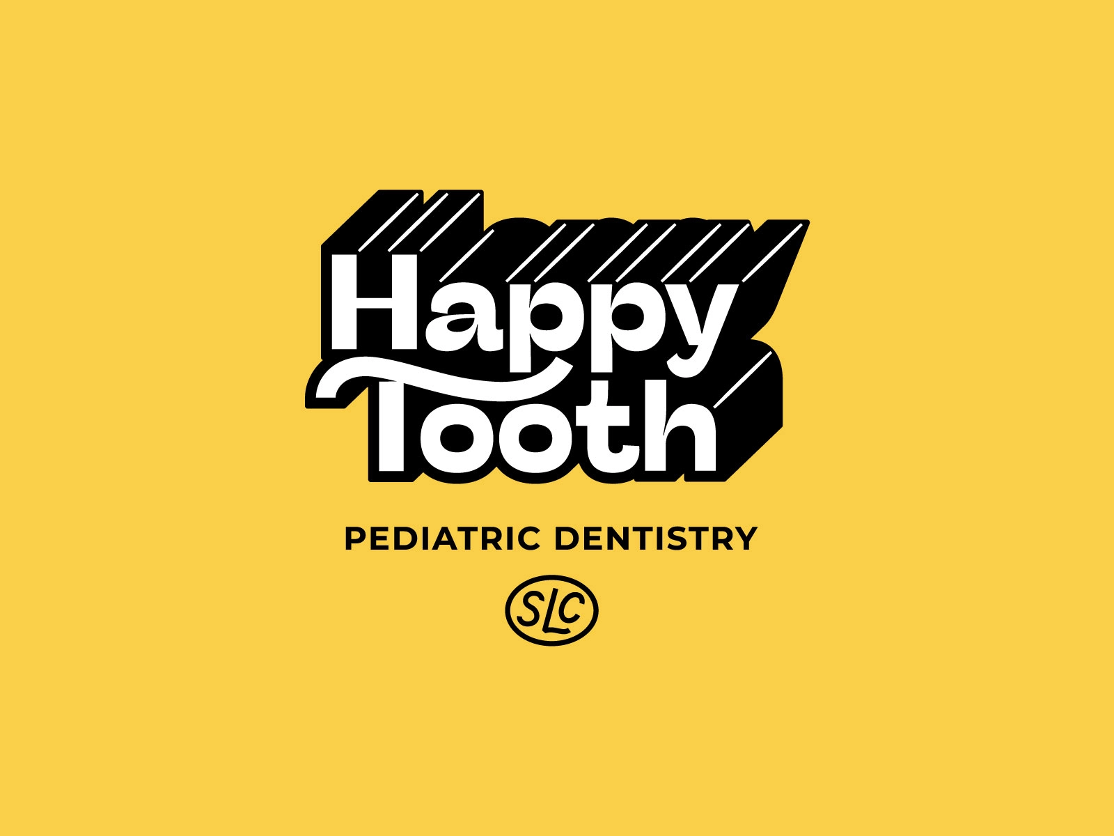
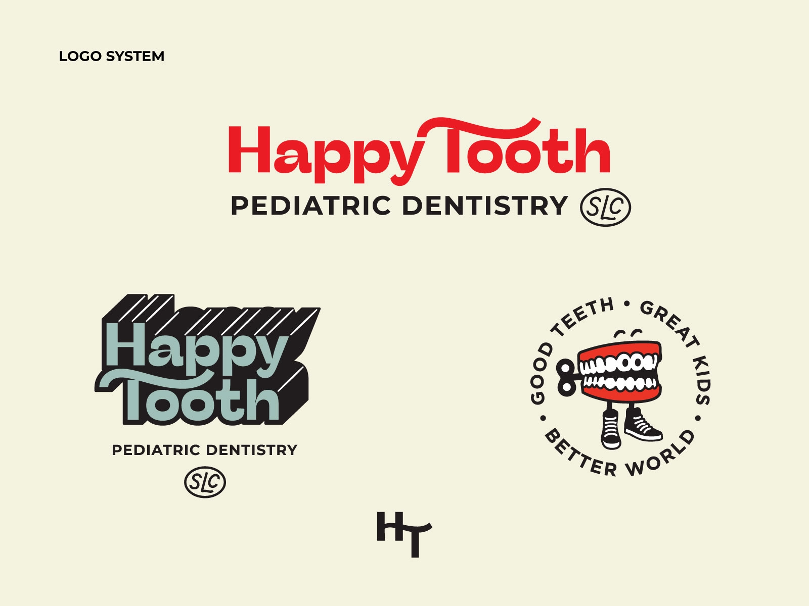
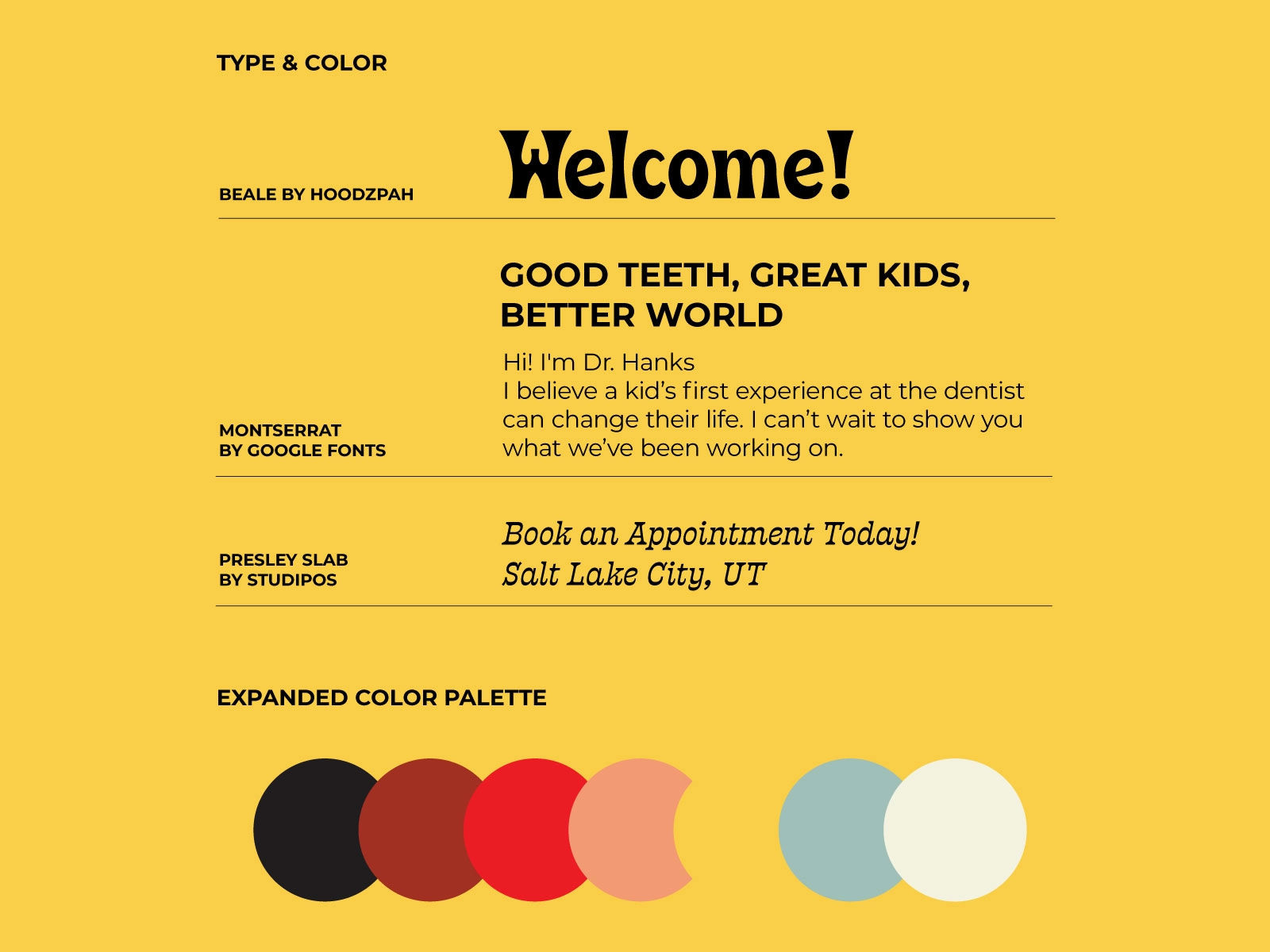
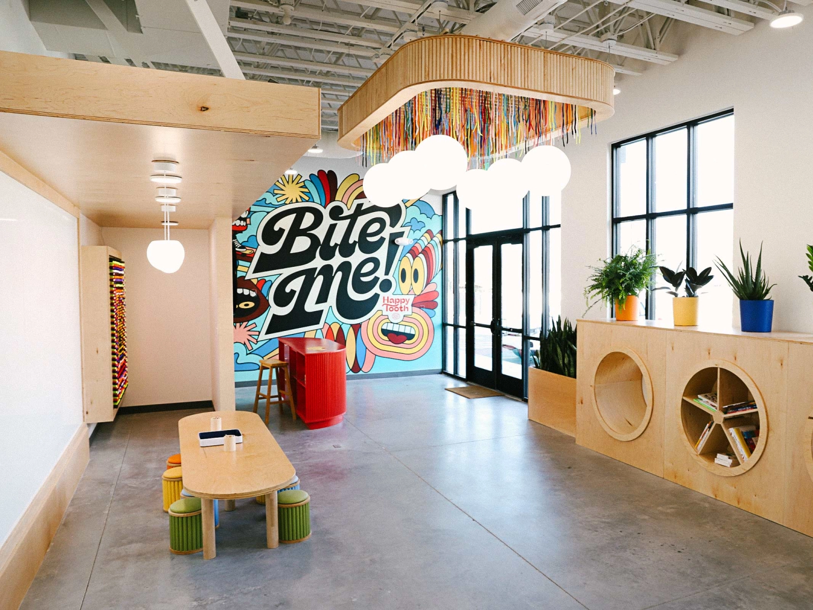
Design studio Hoodzpah created a branding package to make visiting the dentist a little more appealing to pediatric patients. The package includes an expanded color palette, four signature fonts, and a complete logo system. Each logo clearly adheres to the expanded color palette, making it easier for the brand to be consistent in its messaging. View part of the branding package here!
My Next Season Branding Package
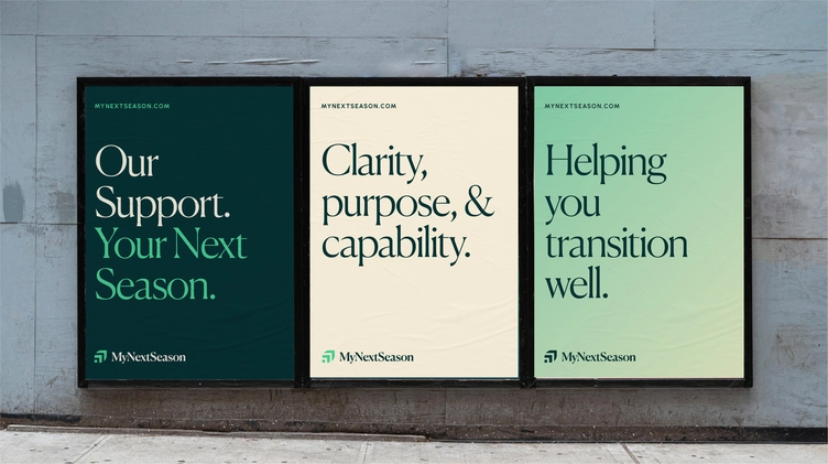
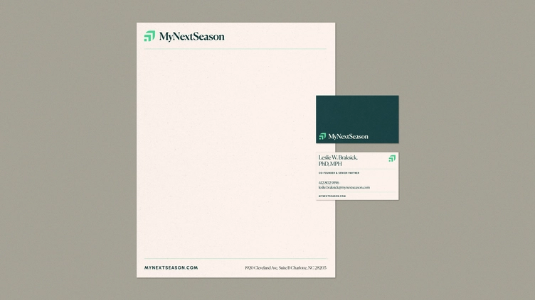
Freelance brand designer J.D. Reeves did a complete rebrand for My Next Season, a company that helps its clients make successful career transitions. The new logo is similar to the original, but it’s much simpler and has a more modern look. Reeves also removed the tagline from the original logo, making it look less cluttered. The simple leaf design matches the company’s view of career transitions as seasonal changes that can lead to better things.

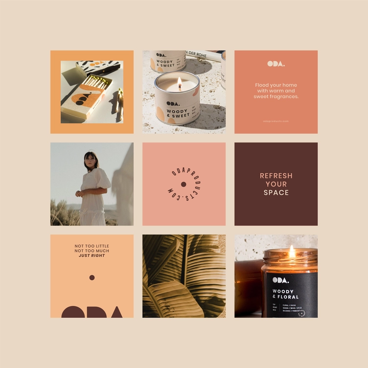
Oda Candles Branding Package
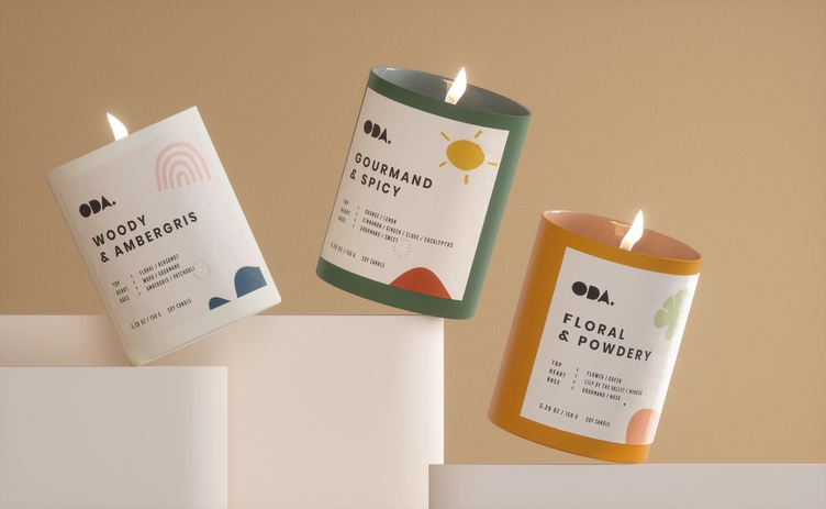
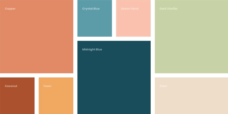
The branding package for Oda Candles has a detailed color palette, which is reflected in each candle’s label. Designer Mustafa Akulker also used typefaces that reflect the brand’s commitment to creating products that help customers relax while making it easier to live an eco-friendly life.
Boost your business with a branding package
Now that you understand the benefits of having a branding package, it’s time to get started on your own. Visit Dribbble Hiring to hire a top brand designer and find out more about how a branding kit can help your business.