The Power of Product Illustration: Engage & Captivate Your Users

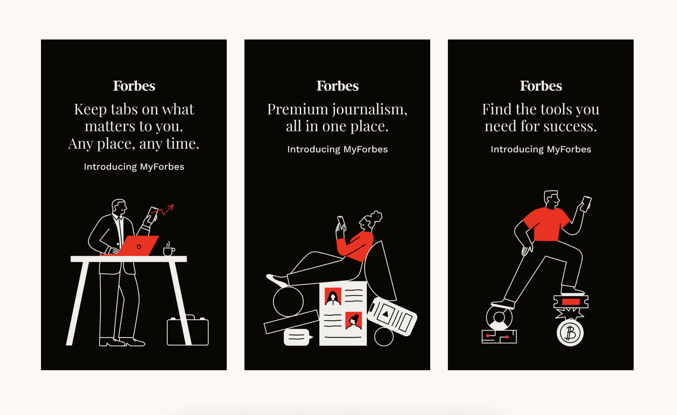
You’ve seen these illustrations in your favorite digital products—floating bright-colored people greet you as you browse through the web pages of Slack. Whimsical characters rendered in fluid brushstrokes grace the landing pages of MailChimp. Vectorized cars appear on the screen as you book a ride through Uber.
What exactly are these digital illustrations and why are tech companies suddenly embracing this art form? Enter product illustration.
What is product illustration?
So what exactly is product illustration and what is it used for? In product design, product illustrations are used to add a human element to your user experience, and to communicate complex ideas in a simplified, attractive way.
A good example of how product illustrations are used in digital products is Alice Lee’s illustration work for Wealthfront, an investment service firm. Financial products are generally perceived as serious and harder to understand. Alice’s illustrations, however, changed that perception by bringing approachability and warmth to finance (see image below).
To do that, Alice used metaphors to represent financial concepts. For example, plants represent money while groups of plants represent an increase in the customers’ investment. While plants can be watered and grown, similarly, investments can be grown and managed as well.

Product Illustration vs. Editorial Illustration
You might be wondering—aren’t product illustrations the same type of illustrations found in magazines and newspapers such as TIME Magazine or The New York Times? Not quite.
Product illustration differs from editorial illustration in terms of intent. Product illustration aims to bring delight to the users’ experience. It is also used to explain the benefits of a product and eventually, persuade people to love the product. Editorial illustration, on the other hand, captures readers’ interest and engages readers in the content. Editorial illustration also breathes life into the stories people are reading.
When to use product illustration
As a rule of thumb, product illustration shouldn’t be used for the sake of ornamentation alone. Otherwise, users will only end up distracted, confused, and maybe even frustrated. Instead, product illustrations need to have a clear intent as to why they’re being used.
Some of the best use cases for product illustration are:
- When the accompanying text is harder to read and understand
- When users need to know what to do next
- When onboarding users
- When a user has reached a goal and you want to congratulate them
- When a user is confused or frustrated

Tips for implementing product illustration
Now that you know what product illustration is, let’s take a look at some of its main characteristics, and share some practical tips for successfully implementing these illustrations. These tips will also serve as useful for illustrators who want to break into the product illustration space and build a strong illustration portfolio.
For more product illustration inspiration, be sure to browse Dribbble for more ideas.
1. Keep styles consistent
The smallest details — colors, line treatment, perspective, and the like — all matter here and can either make or break your illustration. For example, if you made several illustrations with rounded edges and oversized proportions and you decided to have one illustration with sharp edges and slender figures, your work ends up looking inconsistent.
Why is this a problem? One reason is that inconsistency erodes trust. Another reason is that an illustration is reflective of the product and the brand identity it’s tied to. If an illustration lacks in quality and consistency, it also speaks the same for the product.


2. Keep details minimal when designing for smaller screens
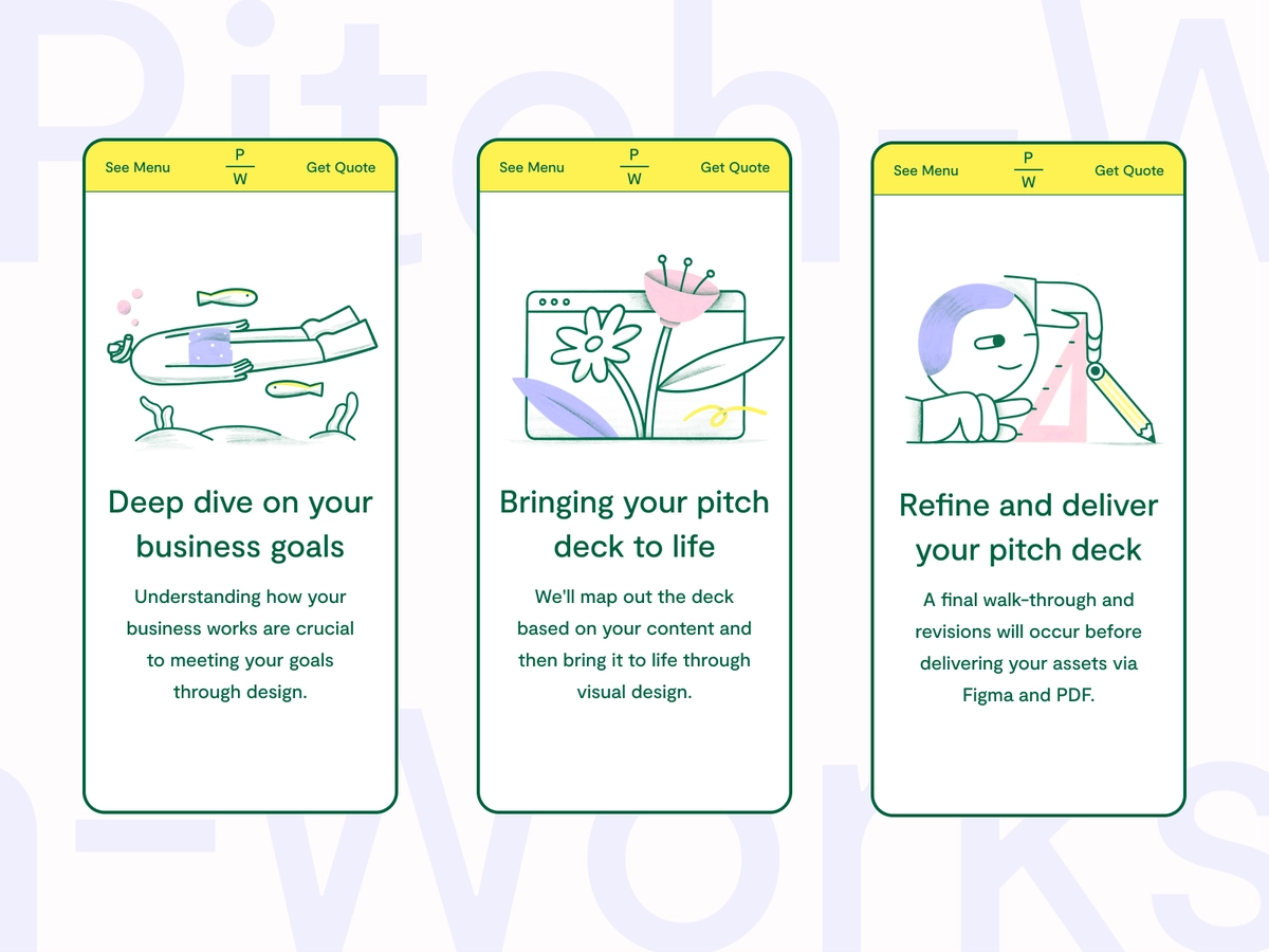
While detailed illustrations make a concept more convincing, they can also visually backfire when scaled down to smaller sizes. Illustrations that look great when viewed through a browser may look cluttered when viewed on a mobile phone.
With mobile illustrations, it’s best to keep details minimal. You can do this by taking out details that don’t add much context to the illustration. For example, if you illustrated a cookie with twelve chocolate chips on it, you can reduce the chocolate chips to five when scaled down. After all, you’d still know it’s a cookie even if seven chocolate chips were taken out.

3. Use metaphors to communicate abstract ideas
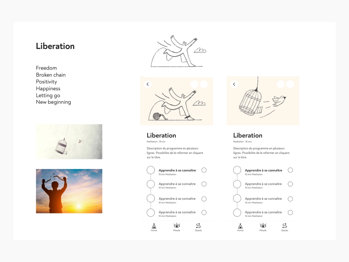
People use products because of the things they can achieve through them. For instance, people use Shopify because they want to start and grow their online business. People use Asana because they want to be more productive with their work. People use Google Drive because they want to access their files anytime and anywhere.
These ideas tend to be abstract in nature and are harder to convey through illustration. Using metaphors solves this problem because they relate an intangible concept, like being productive, to something tangible, such as having several items ticked off a to-do list.
One of the most effective ways of coming up with metaphors is to relate the abstract to the concrete. Say you’re asked to illustrate the idea of designing your own website from scratch. You can come up with metaphors by completing this sentence: “Customizing my own website is like _____.” One answer to this is the idea of “painting” the screen of a desktop with real paint and paintbrushes. Paint buckets of varying colors can also be drawn to further highlight the concept of customization.

Elevate your brand with product illustration
Product illustration is a powerful way to highlight the benefits of a digital product and convince others to use that product. While product illustration shouldn’t be the go-to solution to improve a product, when used appropriately, it can attract users and make a product stand out from the competition.