5 Creative Photo Editing Tips Every Graphic Designer Should Know

Everyone wants to look beautiful, or at least, they want their photographs to look perfect. Pictures taken right from a camera may look fine, but they are far from perfect. If you want your photo to stand out, then it needs to look better than others.
Similarly, if you are a graphic designer creating your brand or working on multimedia projects, photos are a great approach to connect with your audience. So whether you’re using stock images or your own photography, you want to make sure your photos stand out from your competitors.
Photo editing or post-processing is what makes your photographs flawless. To excel at photo and graphic editing, you need to master certain photo editing tools such as Adobe Photoshop CC, Lightroom, Illustration, etc.
Developing photo editing skills will give you an advantage as a graphic designer. So, if you’re an aspiring or professional graphic designer, editor, or even a photographer, you should learn some creative photo editing skills.
This article will look at 5 simple photo editing tips that you can use to create more aesthetic photos and level up your graphic design compositions. Let’s get straight into it!

1. Photo Retouching
The process of changing a photograph to prepare it for final display is known as photo retouching.
Retouching is the process of removing flaws from a photograph. This could be little things on the camera lens or sensor, such as dust or grime. You can also do retouching to correct some physical flaws on a model’s skin, as seen in many fashion magazines.
Retouching an image typically entails making modest, localized changes to it. As a result, picture retouching services are used to add a last touch to the finished image. Benefits of photo retouching include:
- Creating high-quality, attention-getting pictures that draw users in.
- Give your images a unique look to set your company out from the competition.
- Enhance your images to make the photos look better in the eyes of the buyer.
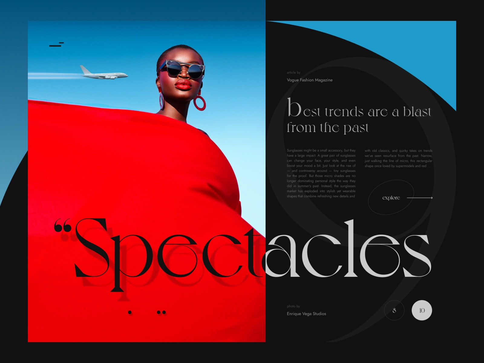
People tend to correlate the visuals they see with the quality of the company. To display genuine images of your business, make the photos stand out by making them look spectacular, legitimate, and professional. This photo editing method will help your brand’s reputation.
Common techniques used in photo retouching
- Spot healing: Used to remove blemishes from the face or body.
- Frequency adjustment: Used to alter the skiing texture of a photo.
- Resizing: Used to remove excessive areas in a photo.
- Toning: Used to alter the tone that affects how the viewer feels.
2. Cropping
Cropping a photo is the simplest way to modify it entirely. You can use cropping to remove undesirable or distracting elements, improve the composition, or highlight a focal point.
The first thing you should do after inserting your photo into a photo editing software is double-checking that it is straight. Framing is a crucial part of taking an image from excellent to great.
The “Rule of Thirds” is the foundation of all photography and cinematography. This photo editing method works by dividing your photo into thirds vertically and horizontally, with four lines (two vertical, two horizontal).
The four spots where those lines cross establish guidelines for where your focal point, or the most significant part of your image, should be placed.
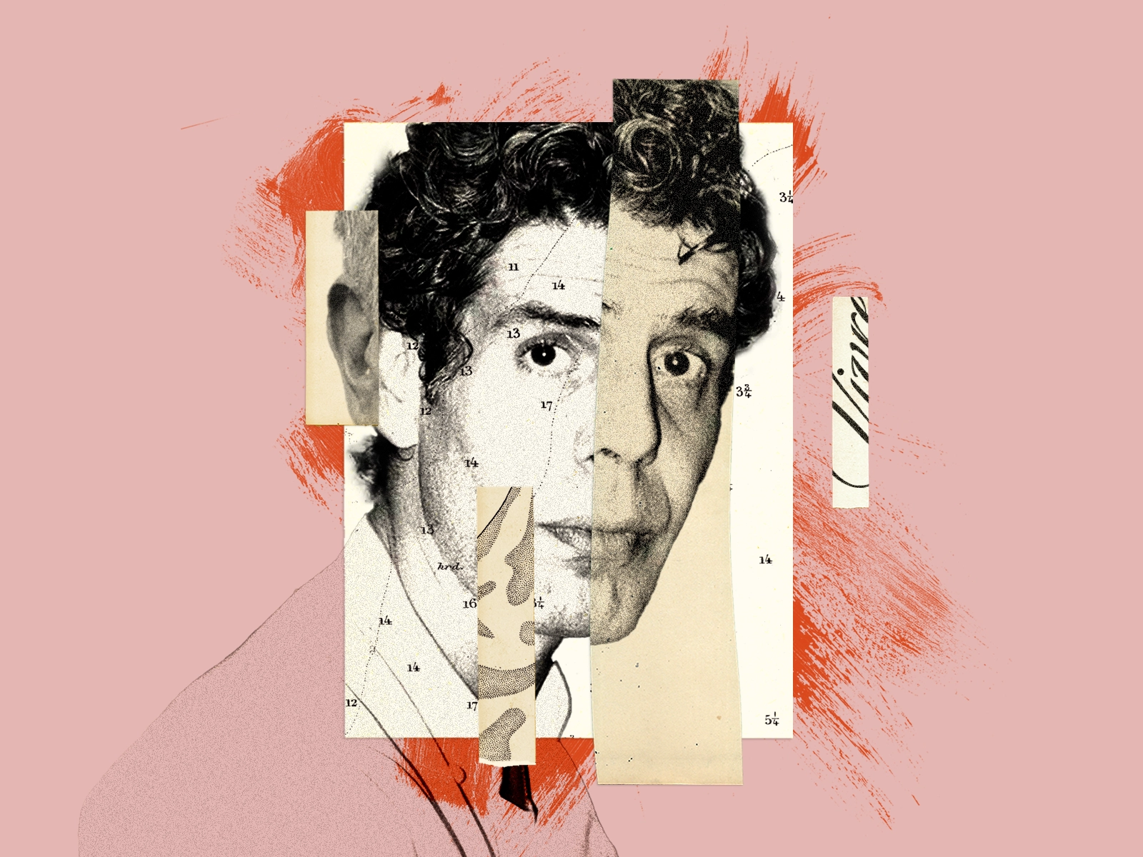
3. Blurring
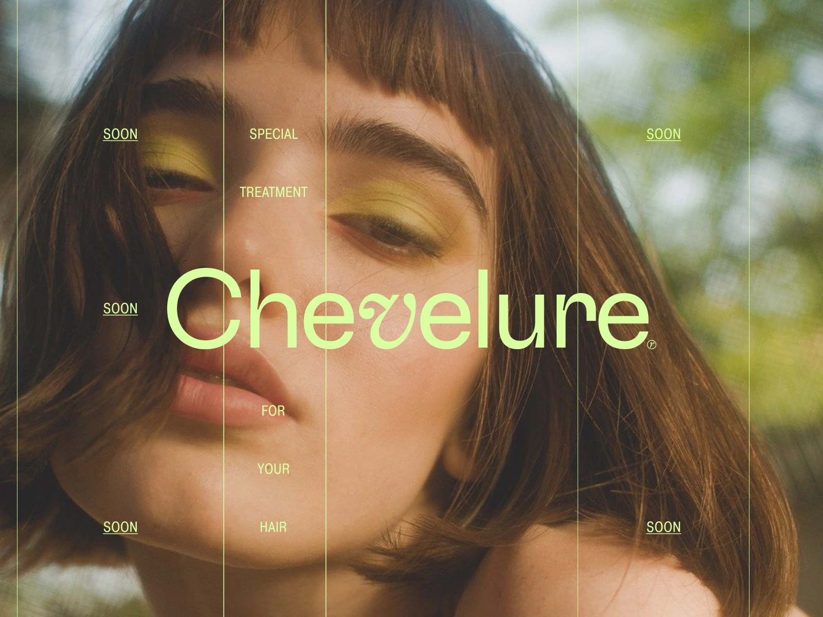
In a variety of designs, photos can make for aesthetically fascinating backgrounds. However, because most designs include text on top of at least part of the background, you’ll frequently encounter a problem: the photo’s details make the text difficult to see.
What is the solution? To produce a clean, uncluttered background, use some blurring. You can keep recognizable shapes or scenes in your backdrop photos with relatively light to moderate blurring.
“When using blurring, elements that are easily overlooked can be brought to the forefront.”
Blurring photos can help you stand out from the crowd and add a layer of intrigue to your images. When using blurring, elements that are easily overlooked can be brought to the forefront.
You can produce a soft, abstract wash of colors or imprecise shapes with a dramatic blurring effect. If you want something more dynamic than a solid-color background, this could be a nice solution.
4. Saturation
Saturation is the purity of a color, as per its definition. The color intensity and vibrancy of an image increase as it becomes more saturated. On the other hand, the lower the saturation, the closer an image is to grayscale.
Saturation, possibly even more so than contrast, is a crucial feature of photography. Because saturation has such a significant impact on the composition and mood of your images, understanding it is highly beneficial.
You can opt to saturate select parts of your image or colors while under-saturating the remainder of the image to draw attention to those regions.
A rise in saturation in the appropriate amounts might improve your image, making an uninteresting photo more vivid and attractive to the eye. However, it’s all easy to go overboard.
Oversaturated images are pouring with intensity to the point of being unappealing to look at. Knowing when it’s enough is crucial as a graphic editor or photographer.
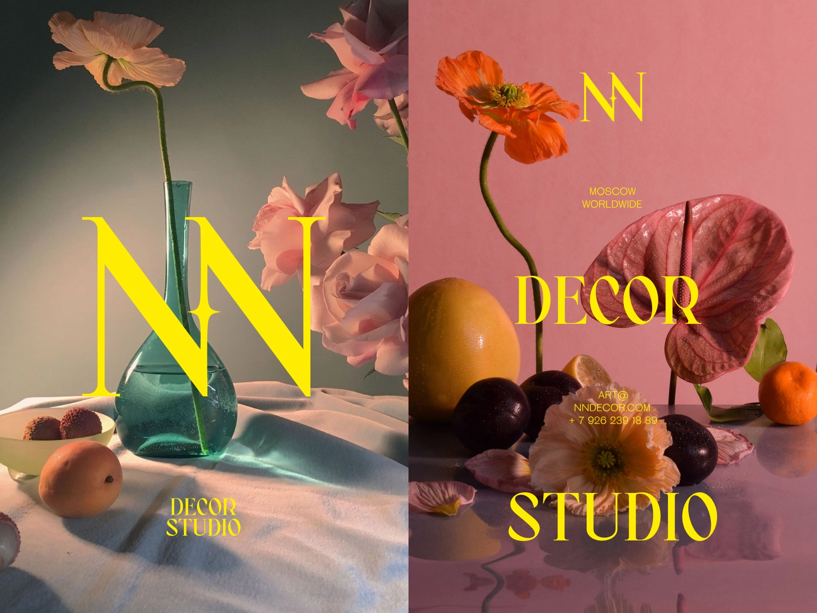
5. Contrast
Contrast is an important photo editing component for conveying specific moods through your photos. It is one of the most crucial aspects of photography.
Contrast lends dimension to a photograph, and dimension can help a photograph become more appealing.
How to use contrast
- High Contrast — You can use it to create a sharp relationship between your photo’s white and dark parts.
- Low Contrast — Removes clarity and definition. Used in advertisements to remove any conflict between the text and image.
- Color Contrast — Used with color photos, it helps your subject stand out from the background.
- Tonal Contrast — You can use it to establish a difference between the light and dark parts of your image.
- Texture Contrast — Used to emphasize the subject by giving it a different texture than the background.
- Conceptual Contrast — You can achieve it by combining a subject and background that logically don’t go together.
Understanding contrast and how it might aid the viewer’s interaction with a shot is crucial in honing your photographic abilities. Using contrast encourages your audience to use their imagination.
Differences naturally engage us, so integrating contrast in your images provides you an advantage in the battle for attention. Make the background of your subjects stand out.
Contrast should not be confused with clutter. Your audience may be confused or irritated by a cluttered background. Make sure the contrast aspects you employ are easy to comprehend.

Use these photo editing tips in your graphic designs
Ready to elevate your graphic designs using these photo editing tips? Try using the techniques above such as cropping, blurring, photo retouching, saturation, and contrast to produce beautiful photos with intricate graphics. We can’t wait to see what you create!