How To Create Moodboards That Guide Your Design Projects
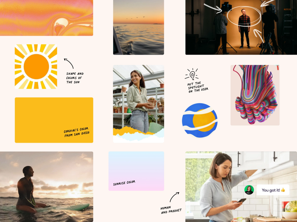
Moodboards have been used in the design world since before the advent of digital design. They’re used in everything from fashion or architecture to flesh out ideas before embarking on the more complex (and expensive) parts of the design process.
Creating a moodboard is one of the first steps in any design project. Some designers overlook this step, preferring to dive directly into creating wireframes. But skipping this step can create problems down the road, particularly with stakeholders, when changes are harder to make. In this article, we’ll explain how to craft moodboards that are both beautiful and effective.
Start with your keywords
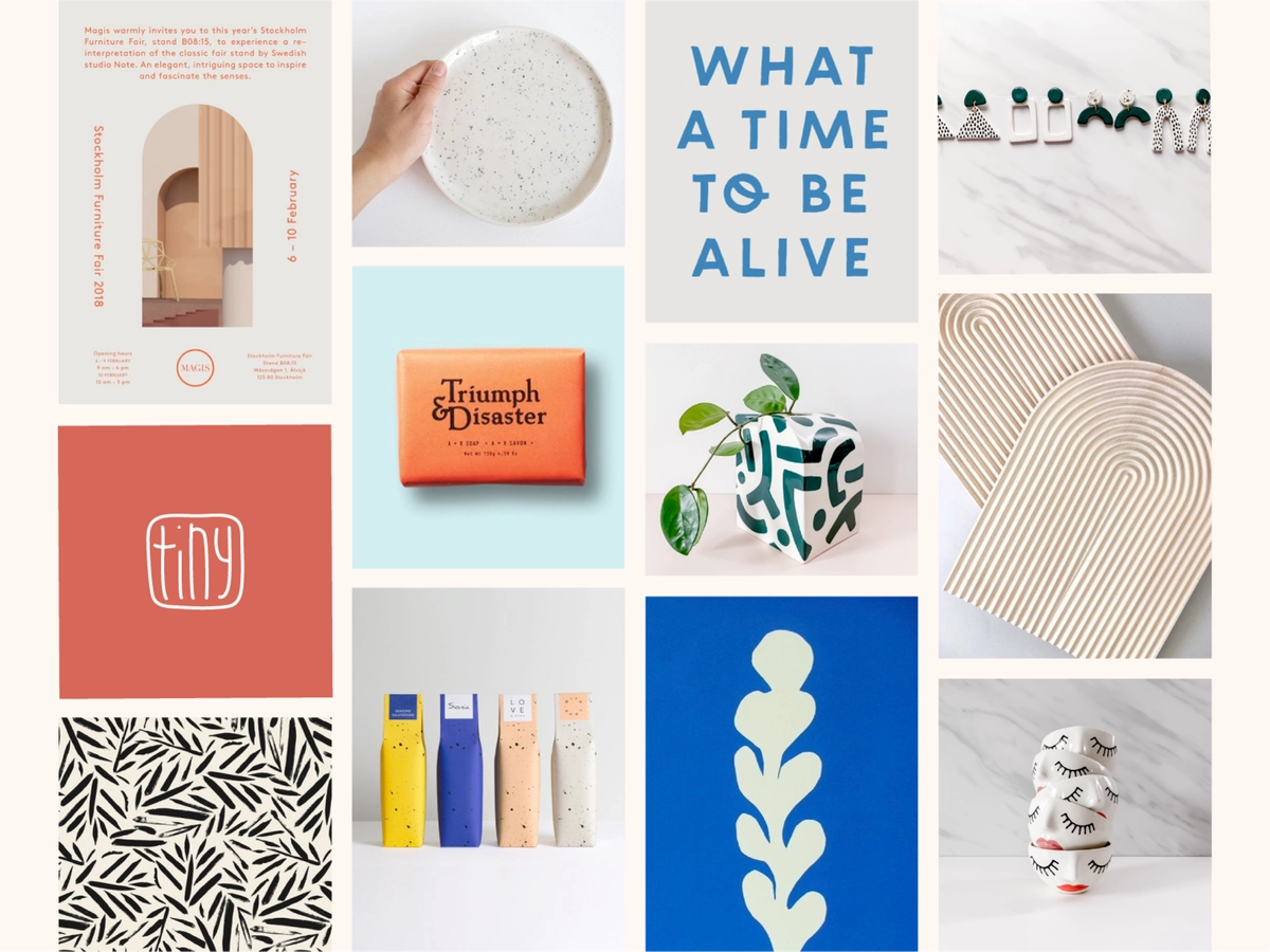
When creating a moodboard, you should virtually always start with keywords that describe the brand or specific project. What are the brand’s values? What emotions should the project evoke from users?
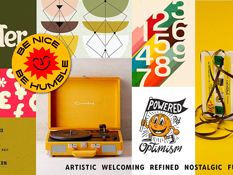
Some designers opt to include those keywords directly on their moodboards, while others just use them as guidance during the rest of the process. In either case, they’re a valuable first step that provides direction for future choices.
Who is a moodboard for?
Moodboards are created to be shared with stakeholders on a project. This could include other designers, UX researchers, marketers, clients and other decision-makers, or others.
Since moodboards are often shared with non-designers, it’s important to make it clear what the purpose of the moodboard is: to give those involved with the project an idea of the visual direction, not to show any kind of finalized deliverable.
What goes into a moodboard?
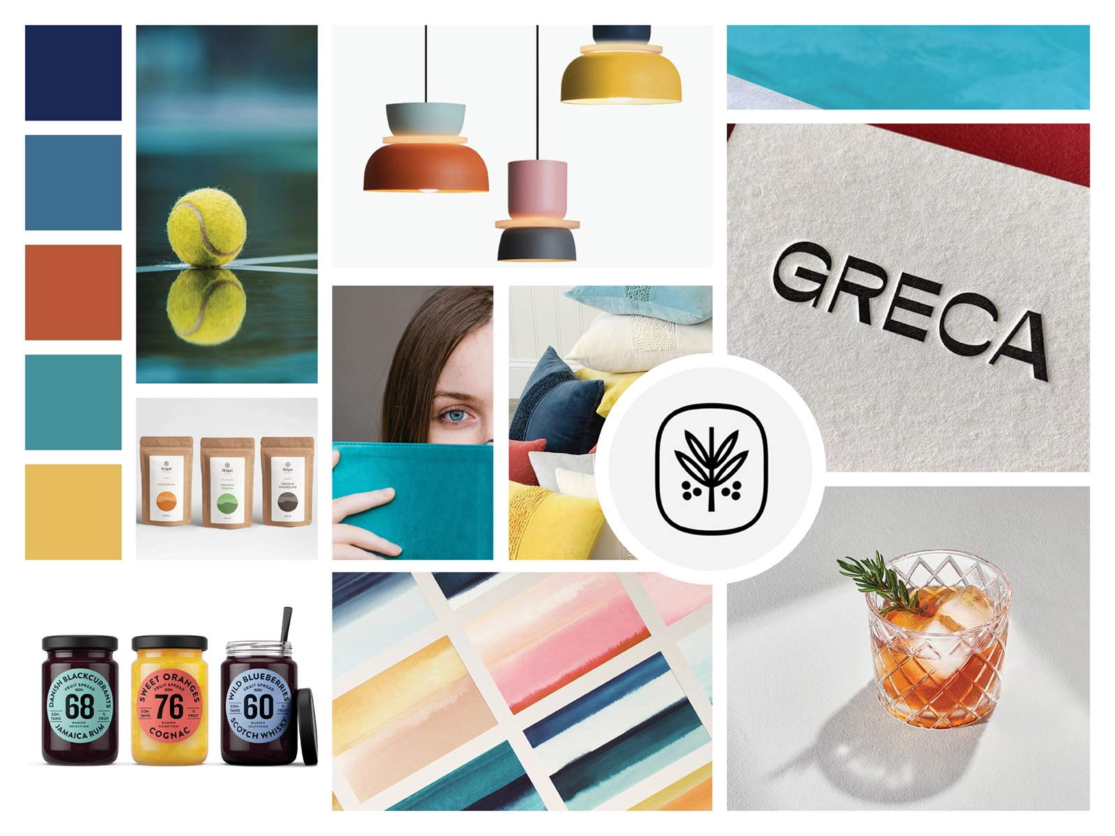
While moodboards can vary in their exact format and content, there are several elements you’ll want to consider including. Color palettes, typefaces, imagery, and other graphical elements (such as borders or icons) should all be included. Some designers also opt to incorporate logos, keywords relating to the emotions or brand values, and patterns or textures to be used in the final design.
“Your moodboard does not have to include finalized elements. The goal is to give your stakeholders an idea of the design direction.”
Your moodboard does not have to include finalized elements. Because it’s goal is to create an impression of the final design, the exact elements are subject to change. The goal here is to give your stakeholders an idea of the direction the design is going for, not to give them final selections on specifics.
That said, remember that non-designer stakeholders may become attached to certain elements in the moodboard, which can create issues down the road if those elements aren’t in the final design. For that reason, sometimes less is more with moodboards.
Pick the right format
Depending on why you’re making the moodboard and who it’s for, you might choose different formats. If your moodboard is just for your own reference and creative process, you might opt to use something as simple as a Pinterest board or swipe file.
If you’re sharing your moodboard with other stakeholders, particularly clients, you’ll want to create a more polished look and feel to it. Be careful you don’t make it appear too polished, though, as that can give the impression that this is the final version of everything included.
“If you’re meeting with clients in person, creating a physical moodboard can be a nice touch.”
Moodboards should be a jumping-off point for discussing the visual elements of a project. Therefore, they should give the impression that things can be changed. If your moodboard looks too “final” or polished, clients might hesitate to speak up about changes, which can create problems further along in the project. Creating something that looks more like a collage and doesn’t resemble a wireframe or mockup can help in this regard.
If you’re meeting with clients in person, creating a physical moodboard can be a nice touch. Presenting in a larger format can wow clients, and also gives you more options for what to include, since you can use more 3-dimensional objects.
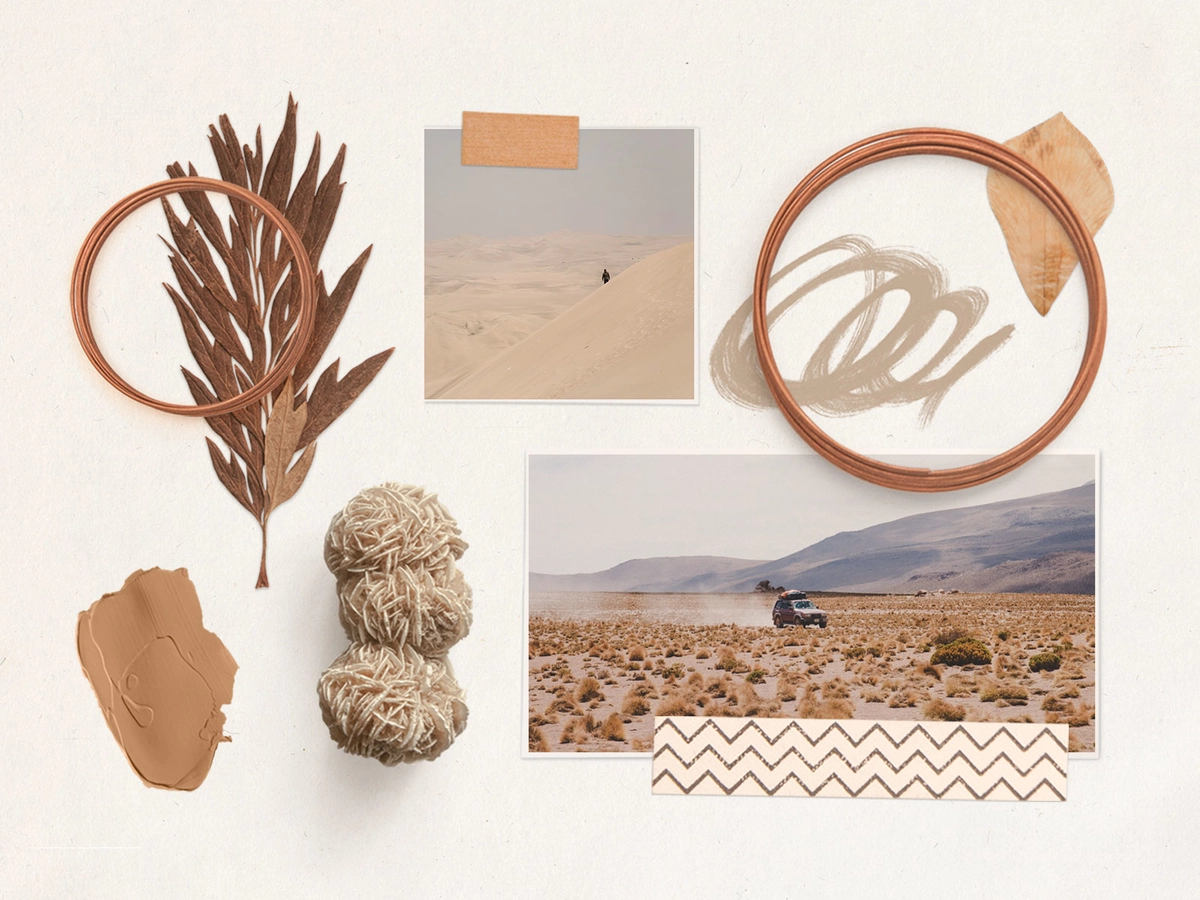
Moodboards should evoke feelings
The entire point of a moodboard is to give stakeholders an impression of the final design, including its emotional impact on users. If you want the final design to have a light, airy feel, then make sure your moodboard and all of its elements have the same feeling. If you want the final design to be more formal, your moodboard should follow suit.
You can do this via the imagery, typefaces, color palettes, etc. used on the moodboard, but also in the way it’s presented. If your final design will be formal and traditional, consider using a more strict grid layout for your moodboard. If it’s going to be casual and fun, you might opt for a collage format instead.
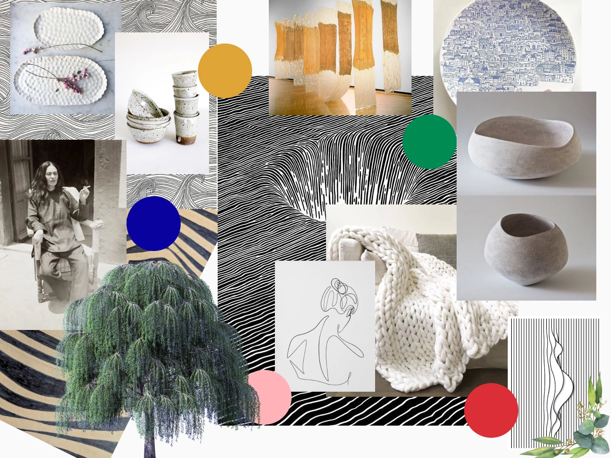
Use your moodboard to explore and kill (bad) ideas
When starting on any new project, you might be filled with ideas. In some cases, you might gravitate toward one idea in particular. But how do you know that’s the best solution?
Moodboards are a lo-fi way to explore all the ideas and possibilities, and to get an idea of what works and what doesn’t. Don’t be afraid to come up with multiple iterations of your moodboards to see what seems like the best solution. And don’t be afraid to kill off those ideas that just don’t seem to come together, even if initially they felt like the perfect solution.
Moodboards can be a vital step in the design process, whether you’re working on a high-profile project with a lot of stakeholders or your own pet projects. They can help you refine and try out ideas without a huge commitment, while also making sure all stakeholders are on the same page before more complex design work begins